Balance, contrast, and harmony—discover how these simple interior design principles can elevate any space from basic to brilliant!
{{ vm.tagsGroup }}
30 Jul 2025
5 Min Read
Phoo Pwint 'Tylia' Thazin (Student Writer)
Balance, contrast, and harmony—discover how these simple interior design principles can elevate any space from basic to brilliant!
Have you ever walked into a room and immediately felt at ease, while another left you feeling uneasy? That’s usually not by chance. More often than not, it comes down to three core design principles: balance, contrast, and harmony — foundational ideas that influence everything from the dream homes we see on TV to the everyday ways we decorate our own homes.
Whether you’re hoping to sharpen your eye for design or just looking to give your bedroom a refresh, understanding these principles can help you create interiors that not only look good but feel good to be in. Let’s take a closer look at each principle, with real-life examples to help you start seeing — and styling — your space in a whole new way.
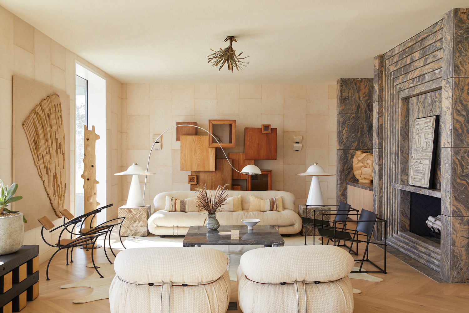
In interior design, balance is about distributing visual weight evenly so that a space feels stable and comfortable. Imagine walking into a room where all the furniture is pushed to one side — it would look off-balance, maybe even feel a little unsettling. That’s why designers pay close attention to how elements like furniture, colour, and lighting are arranged to achieve visual stability. When done well, balance brings everything together in a way that feels grounded, natural, and inviting.
Photo credits: Livingetc
Often seen in more traditional spaces, symmetrical balance means mirroring elements on either side of a central line. Think of a living room with identical sofas and lamps on either side of a fireplace — it gives the space a clean, classic, and coordinated look.
Popular in contemporary interiors, this approach uses different objects that carry the same visual weight. For example, an L-shaped sofa on one side of a room might be balanced by a large artwork or floor lamp on the other. It’s less formal than symmetry, but still feels stable and well-designed.
This type of balance is all about arranging elements around a central point. A round dining table with evenly spaced chairs is a great example — everything radiates outward, creating a sense of focus and cohesion.
Modern interiors often put a fresh spin on balance. While minimalist styles lean into symmetry and simplicity, more expressive ones — like bohemian, eclectic, or industrial — embrace asymmetry for a more relaxed and free-form look. Regardless of the style, the goal remains the same: to create a room that doesn’t feel too heavy or too empty, but just right.
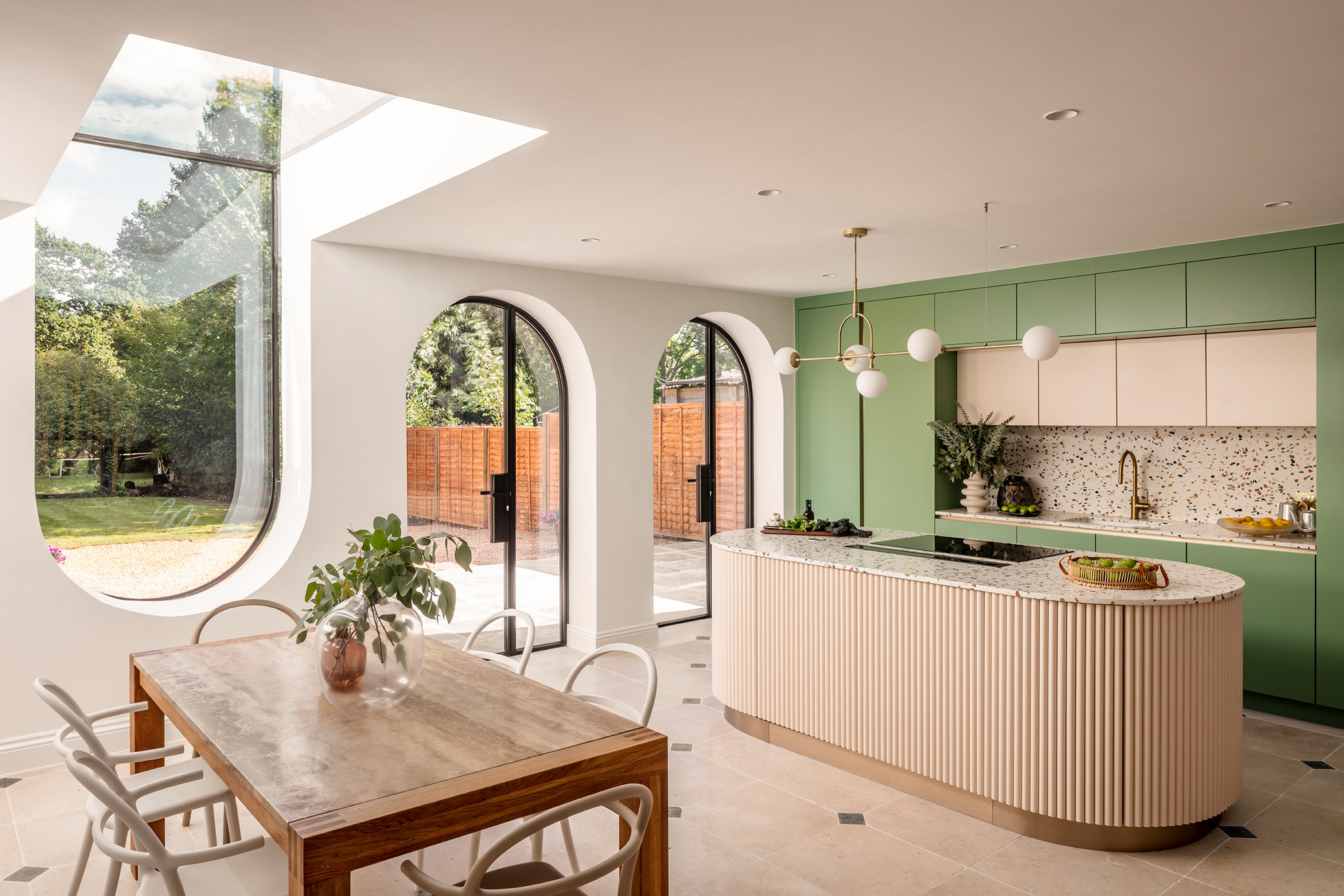
Contrast is what gives a space its spark. Without it, everything blends together, and a room can start to feel flat or dull. By pairing opposing elements — like light and dark colours, rough and smooth textures, or sharp and soft shapes — designers create visual interest through depth, dimension, and drama. When used thoughtfully, contrast adds just the right amount of tension to make a space feel layered, dynamic, and alive.
Photo credits: Houzz
Pairing colours from opposite ends of the spectrum is a simple yet impactful way to add drama. Think navy blue and mustard yellow, cobalt blue and burnt orange, or classic black and white. Even a single dark accent wall in a light-toned room can introduce contrast without overwhelming the space.
Mixing materials like wood, metal, and fabric adds depth and dimension. Picture a cosy reading nook with a braided rug, chunky knit pillows, and a reclaimed wood side table — the varied textures work together to create warmth and richness.
Combining curved and straight lines brings life to otherwise rigid spaces. Arched doorways, rounded mirrors, or circular chairs can soften a room full of straight edges and right angles, making the space feel more fluid and organic.
Too much contrast can feel chaotic, while too little can leave a space feeling static — even safe. The key is to create focal points that draw the eye without dominating the room, whether by pairing bold colours with neutrals or balancing striking textures with softer, more muted elements. Like all good design, it’s about finding that sweet spot between subtlety and statement.
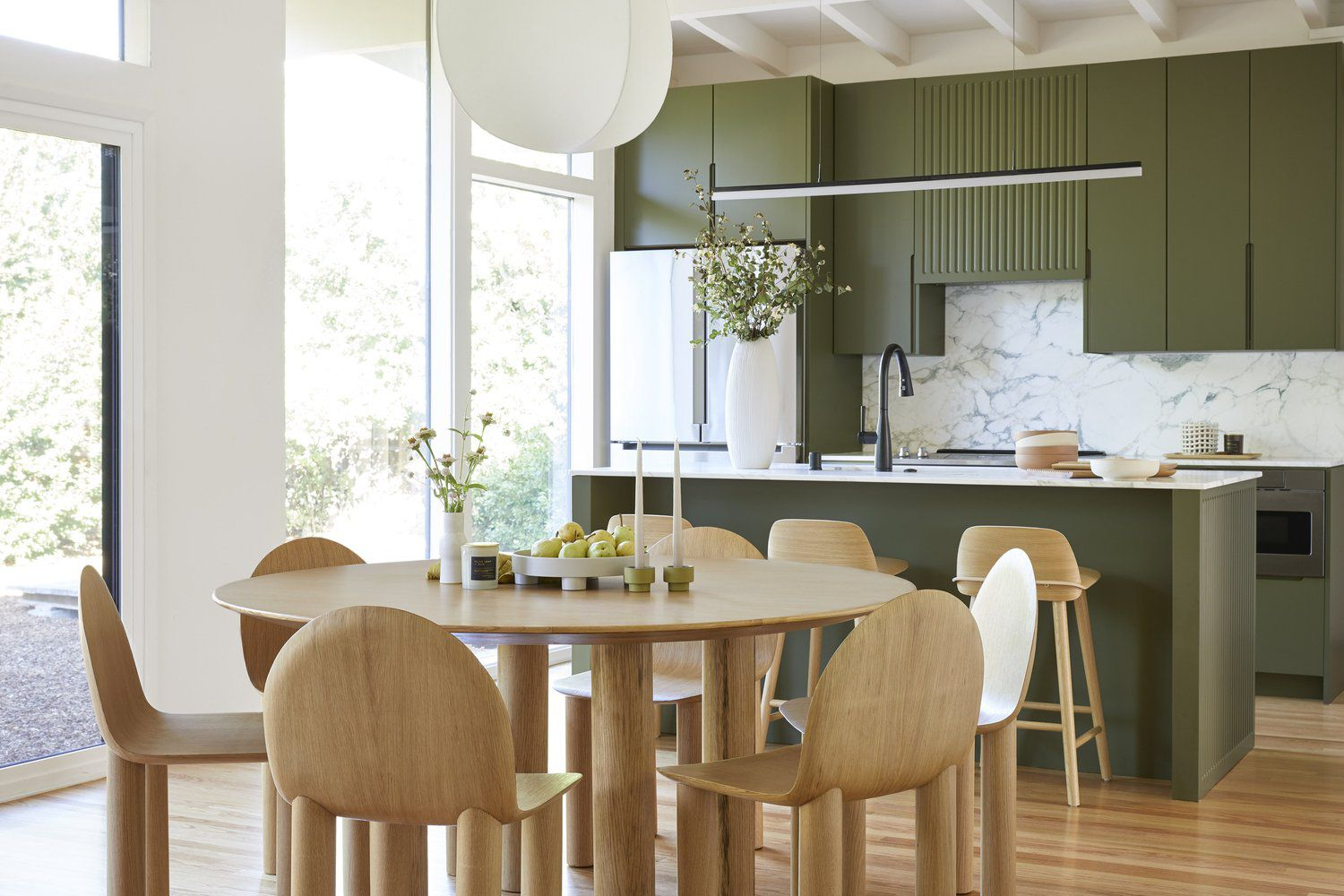
Harmony helps a space feel connected and complete — where every element complements the others rather than competes for attention. While balance creates stability and contrast adds variety, harmony ensures that all the pieces in a room feel like they belong. When a space is harmonious, it feels composed, considered, and well-resolved — each part contributing to a unified whole.
Photo credits: Cathie Hong Interiors
Just like getting dressed, a well-designed space often starts with a main colour and a few complementary tones. Choosing a consistent palette — and repeating it across walls, furniture, and décor — helps tie everything together and keeps the space feeling intentional and in sync.
Beyond colour, repeating shapes, textures, and patterns throughout your space creates a sense of visual rhythm. Patterns, in particular, can be layered tastefully when they share a common motif or palette — resulting in a look that’s both creative and cohesive.
Some design styles naturally embody harmony by blending colour, texture, and form within a clear aesthetic vision. Japandi, for instance, combines Japanese simplicity with Scandinavian functionality, using clean lines, natural materials, and muted tones to create spaces that feel structured yet serene.
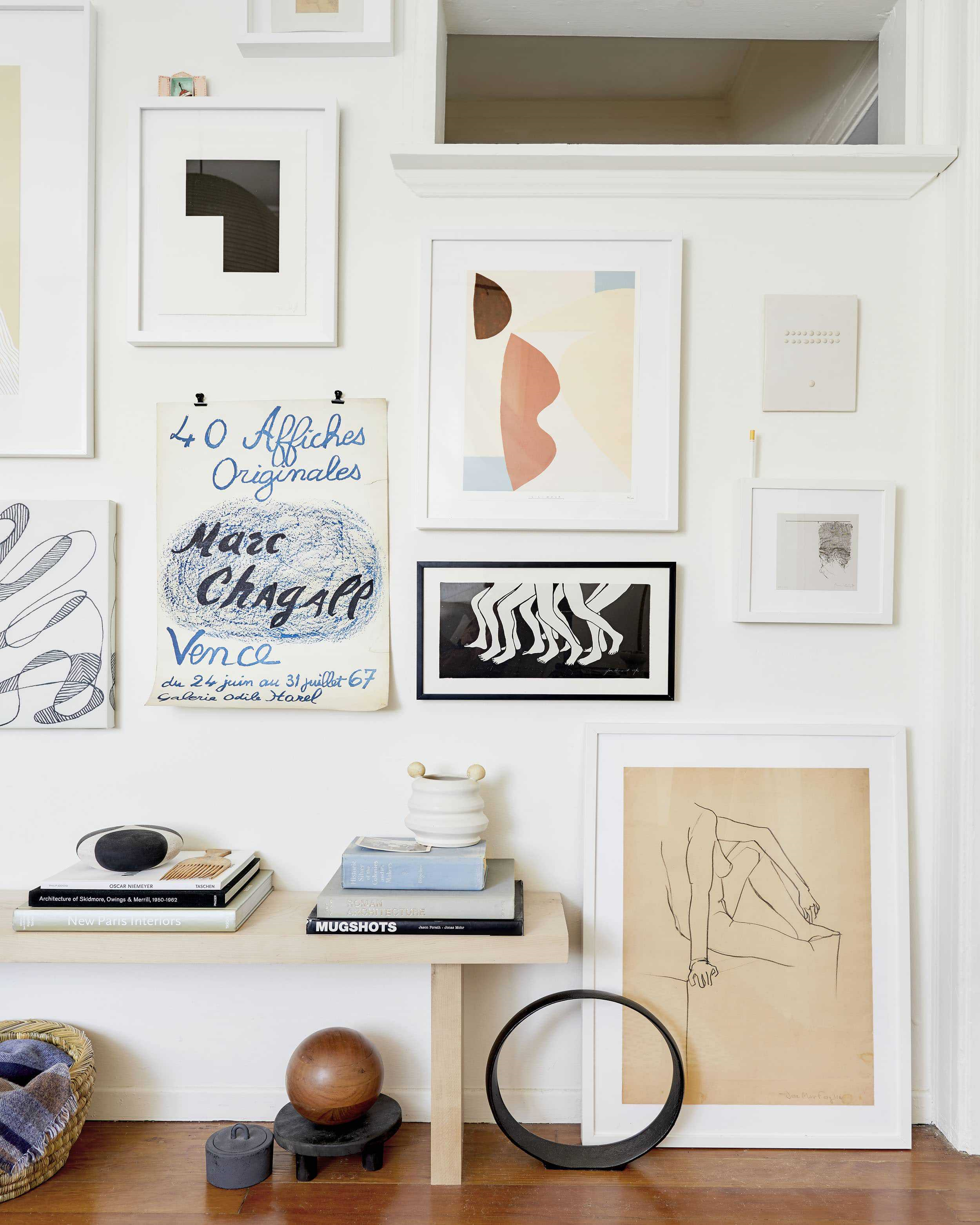
Arrange framed photos or artwork on a wall so the visual weight feels even. Mix larger and smaller frames but distribute them thoughtfully to avoid one side feeling heavier than the other.
Photo credits: Emily Henderson
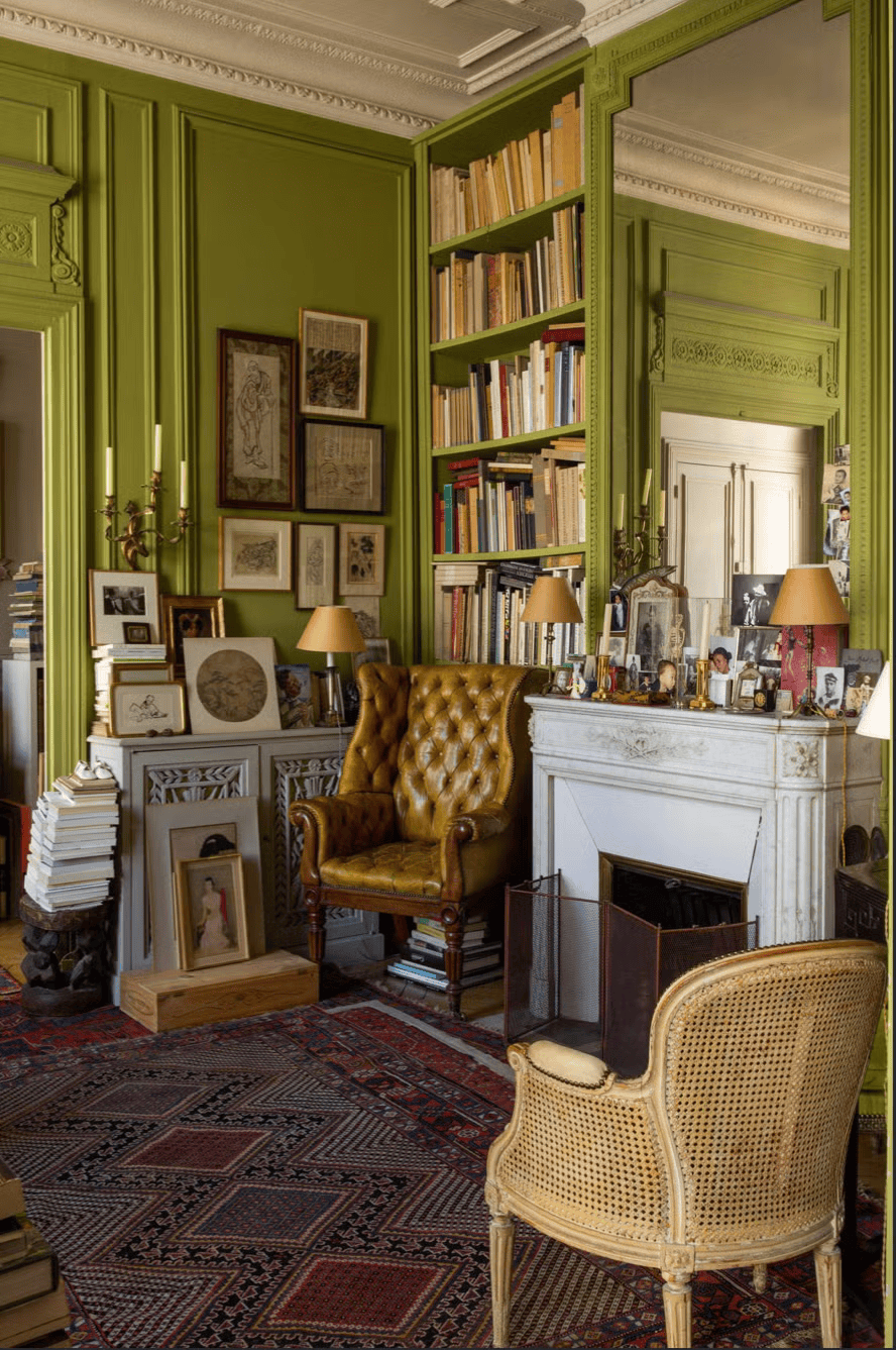
Add contrast by layering different textures in a corner or nook. Try pairing a soft velvet cushion with a sleek leather chair or placing a smooth vase against a rough wooden shelf.
Photo credits: Elledecor.com
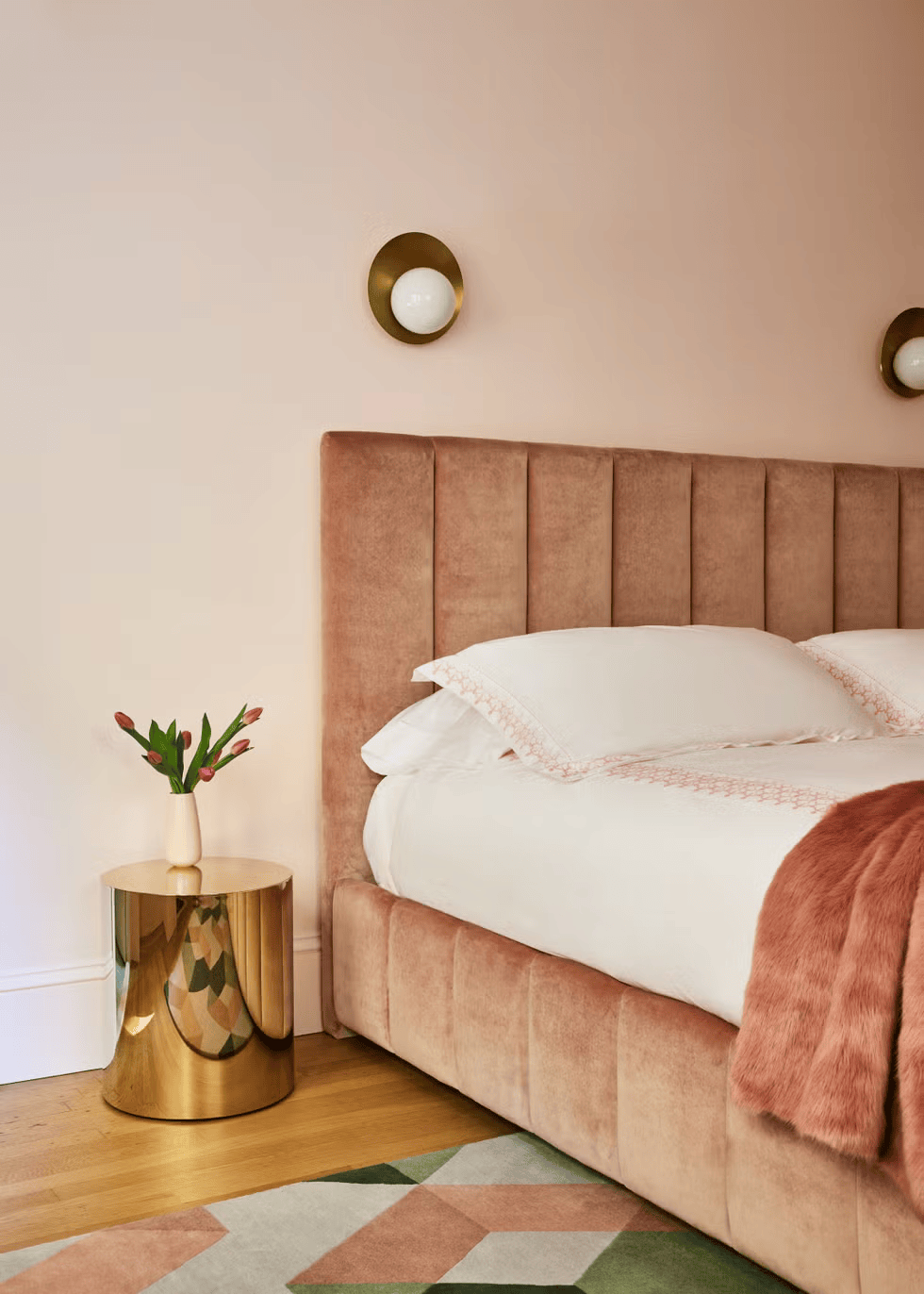
Choose a colour palette for your bedroom by selecting sheets, pillows, and curtains that share similar tones or complementary hues. Repeat patterns or textures subtly to create a calming atmosphere.
Photo credits: VERANDA
Interior design isn’t just about how a space looks — it’s about how it feels. When balance, contrast, and harmony come together, even small changes can make a big difference.
So the next time you step into a room, take a moment to observe: what works, and what doesn’t? Use those insights to guide your own design choices. With a few aesthetic edits, you’ll start to see how these principles can shape not just your space, but the experience of being in it.
Phoo Pwint 'Tylia' Thazin is currently pursuing a Bachelor of Arts (Honours) in Interior Architecture at Taylor's University. With a passion for design and a flair for communication, she seeks to share tips and insights on interior architecture and related topics to inspire and inform her readers.